Kapten
DevOps
Services
Branding • UI/UX Design
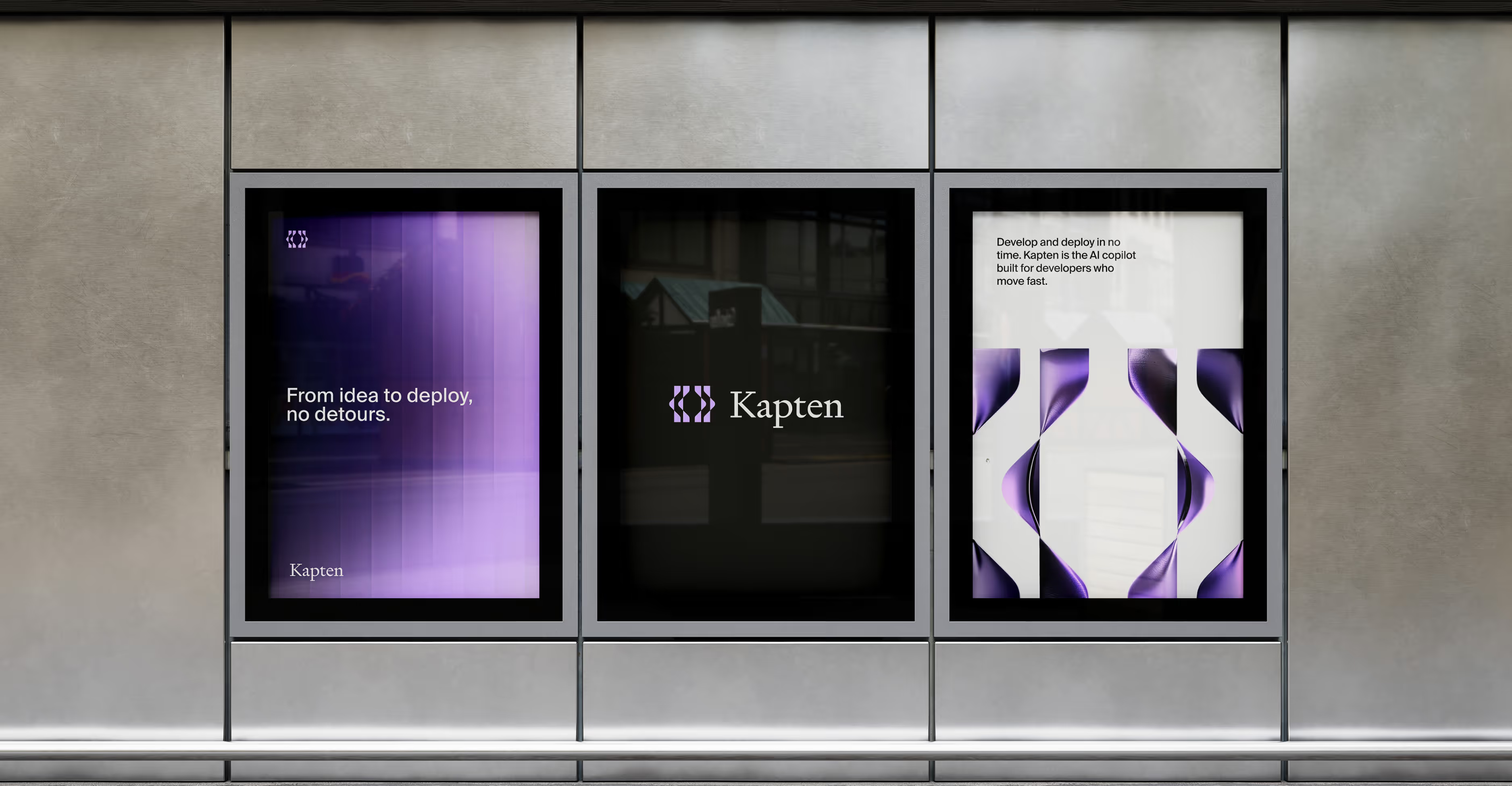
Develop and deploy in no time.
Kapten is an AI copilot built for developers who move fast. The challenge was to brand a product that lives entirely inside the developer's workflow, invisible when it needs to be, indispensable when it matters.
A developer tool brand built to earn trust before the first demo
→
Outcome
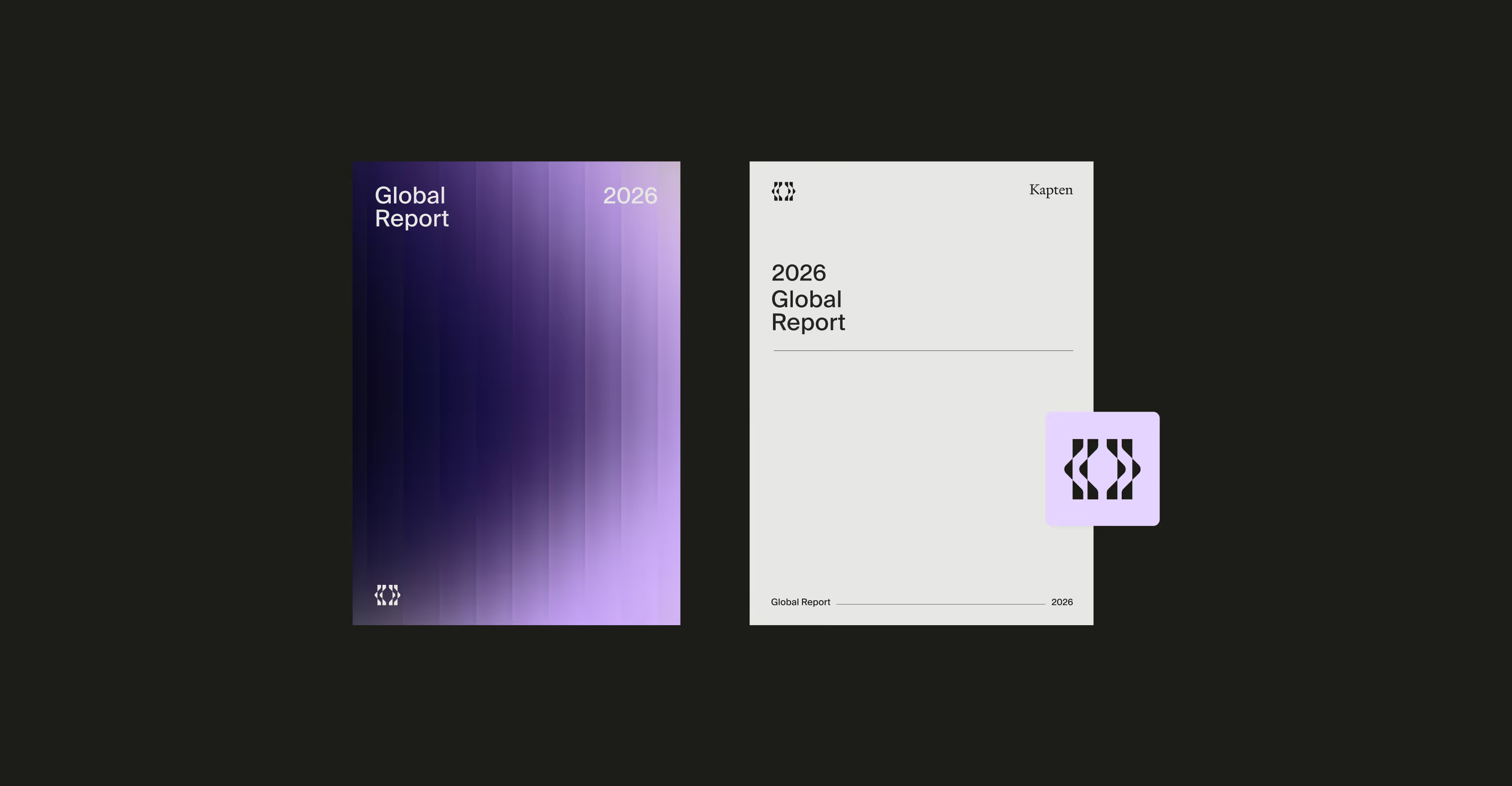
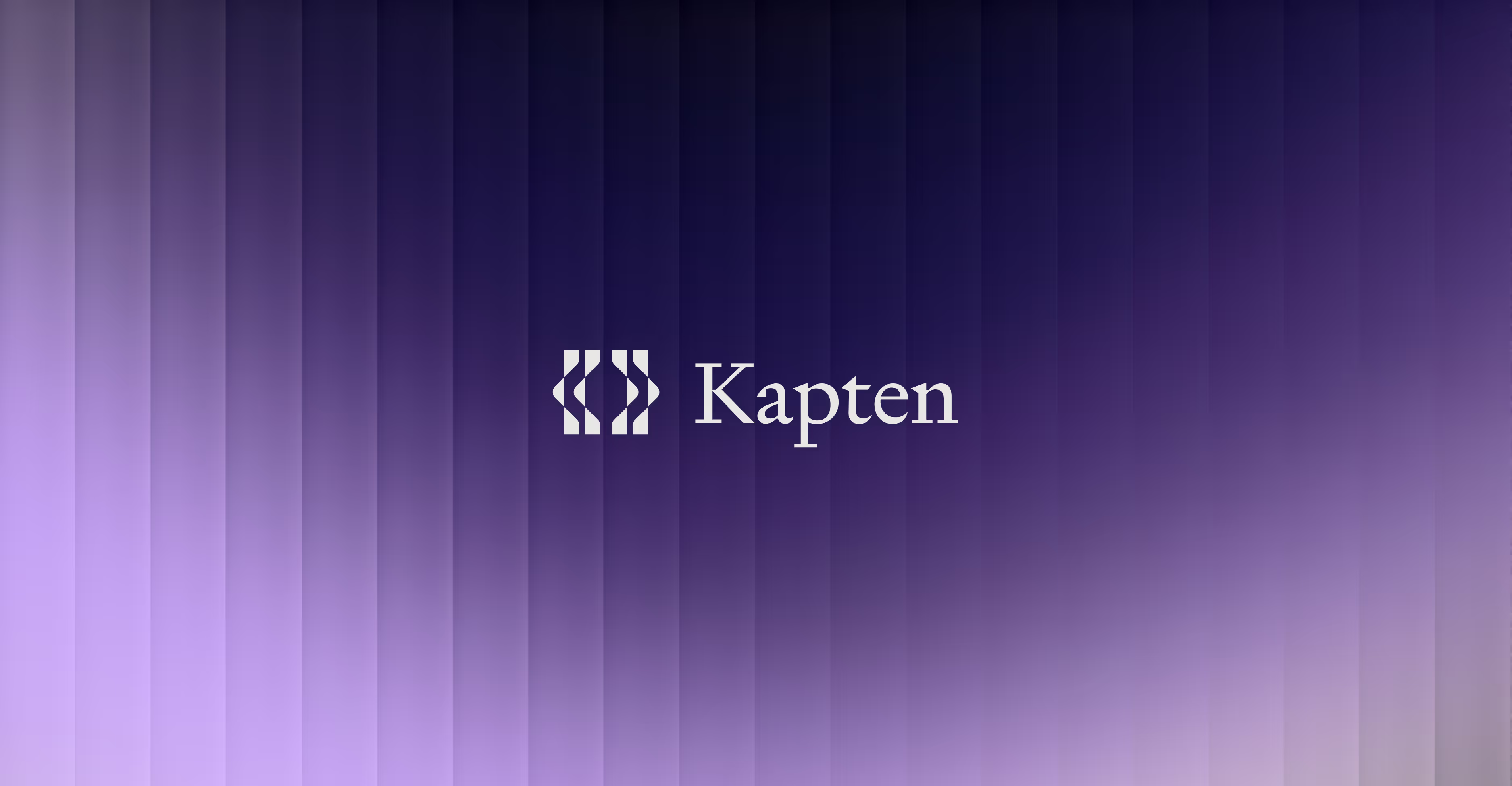
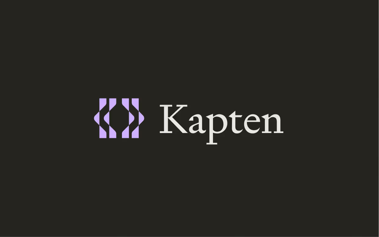
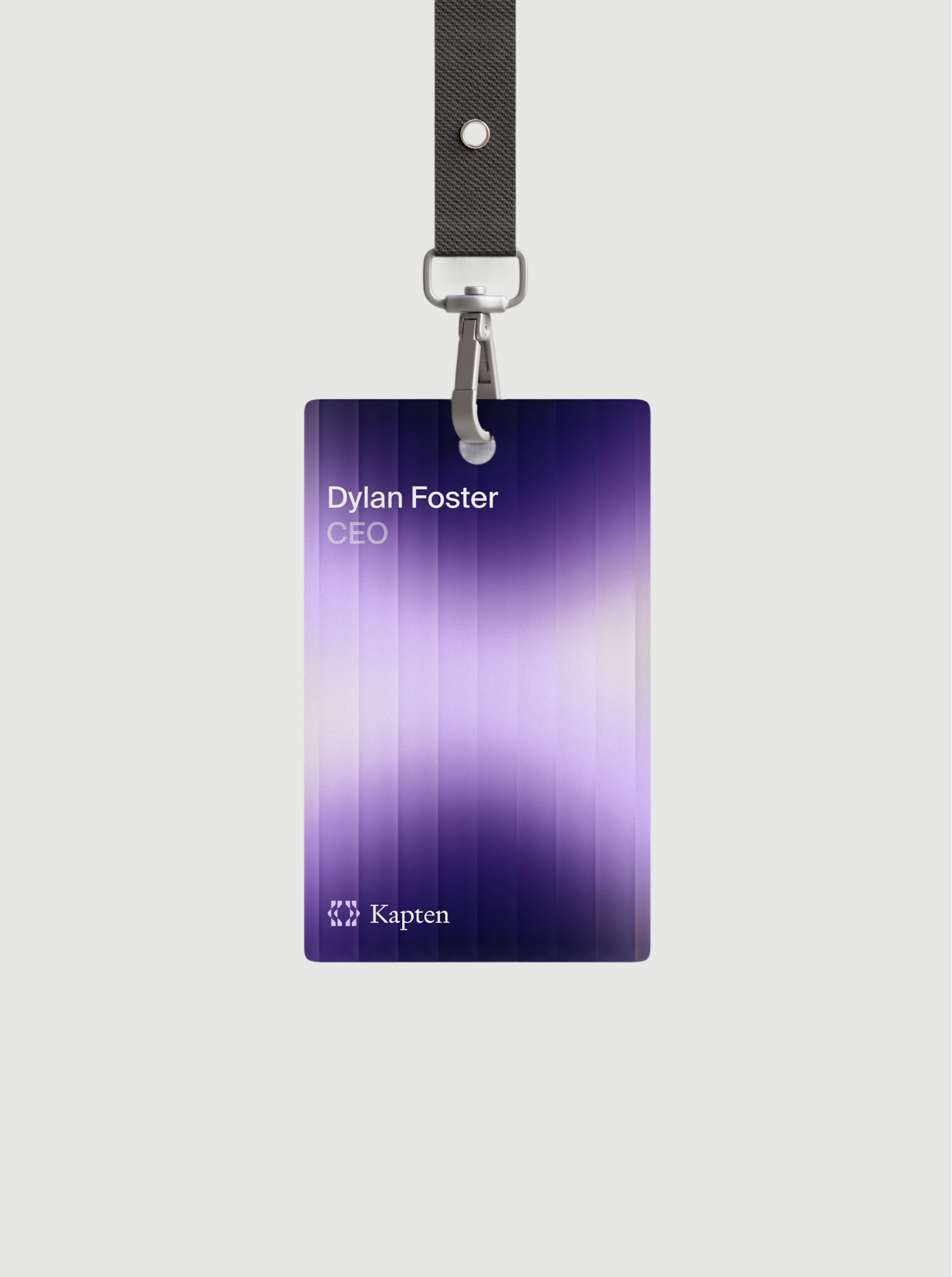
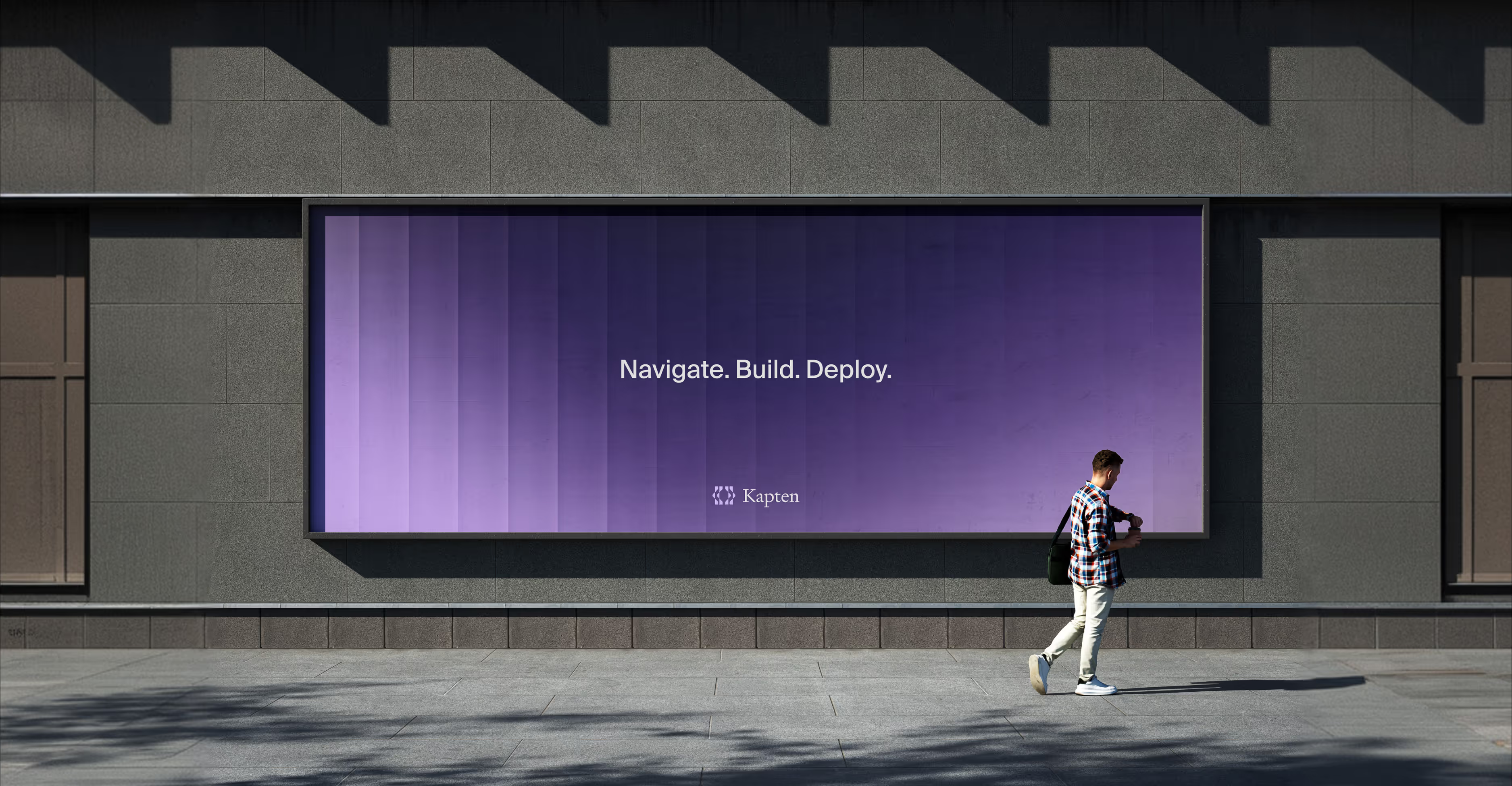
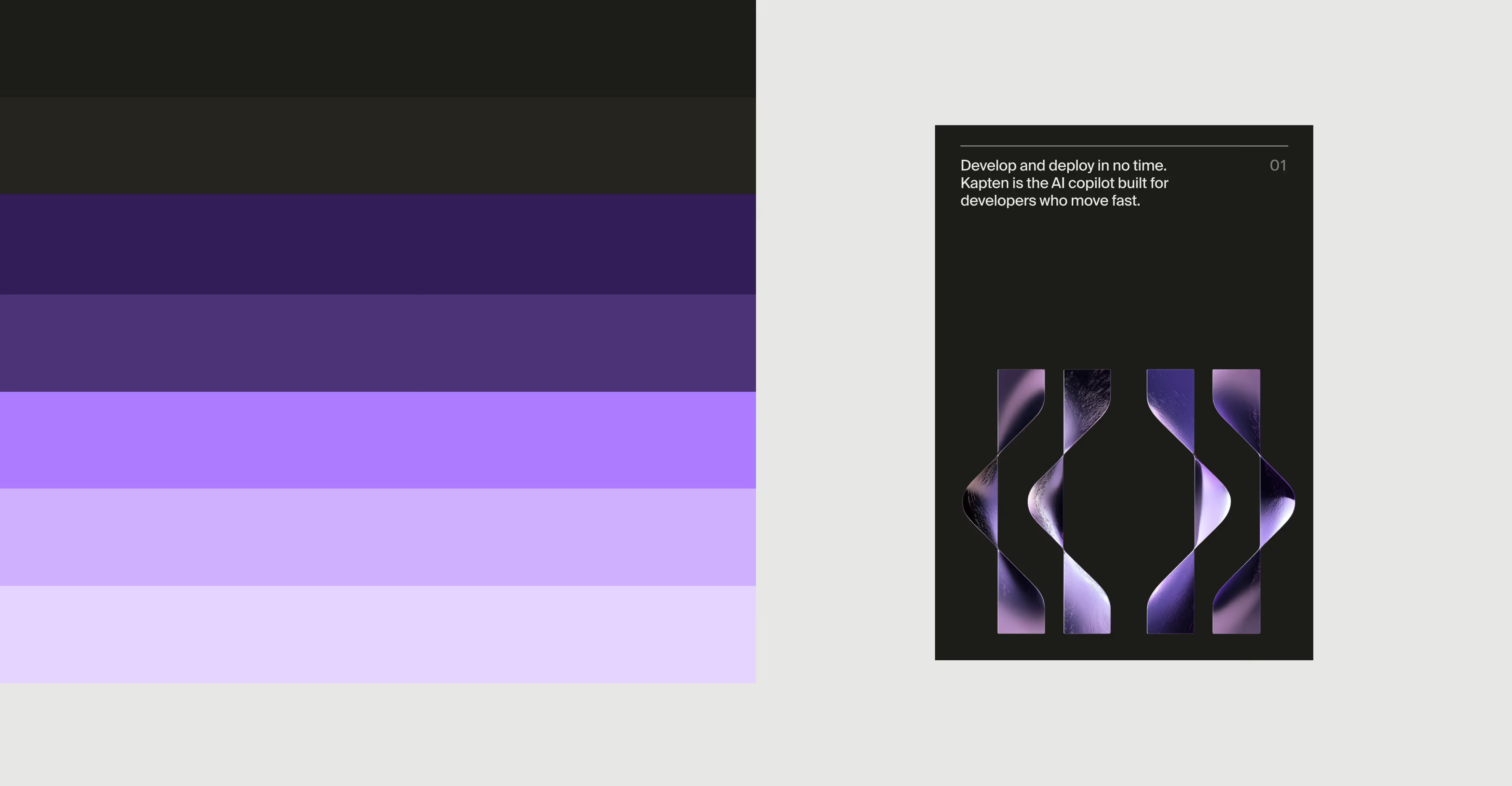
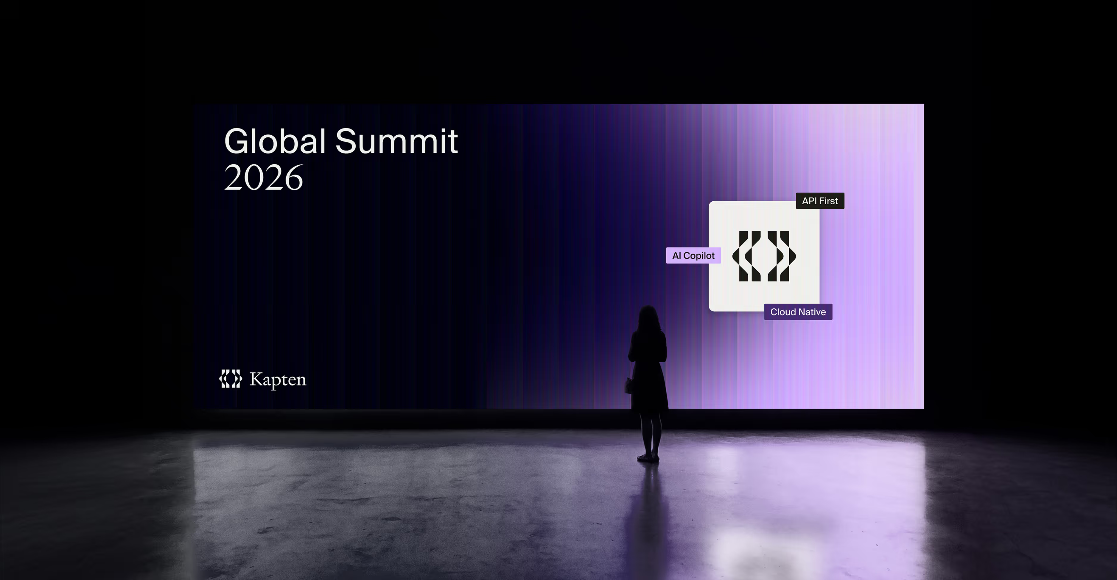
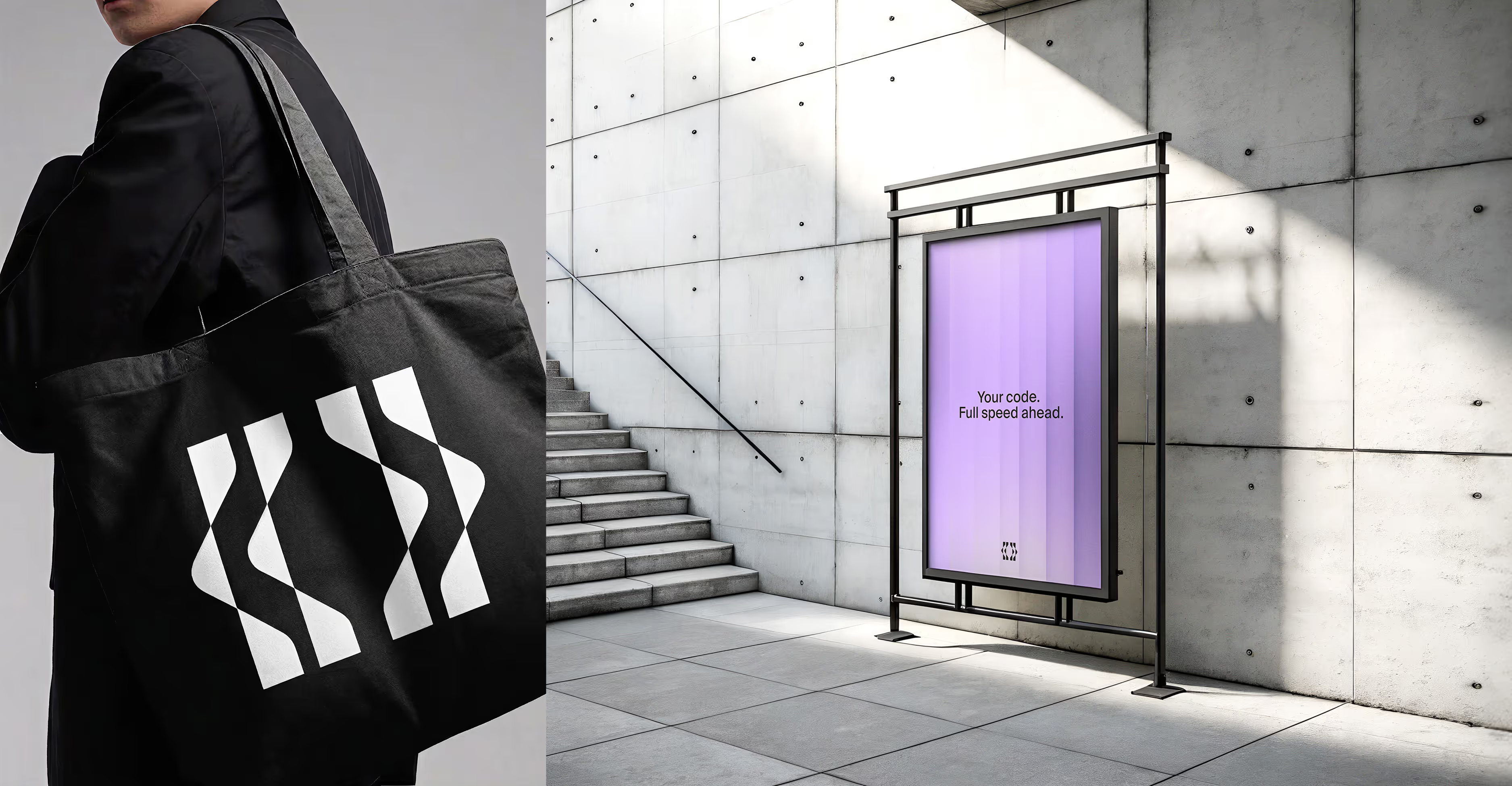
We crafted a visual identity that balances technical precision with quiet confidence: a deep violet palette, a mark built from code brackets, and typography that feels both engineered and authoritative. The result is a brand that developers trust before they even try the product.
Program
Launch
Timeline
5 weeks
Stage
Seed
A strong product in a market that runs on credibility
The problem
The DevOps and AI tooling space is one of the most competitive in B2B SaaS. Developers evaluate tools on instinct before they ever read a feature list — and a weak brand is disqualifying before the product is even opened. Kapten is an AI copilot built for developers who move fast: it lives inside their workflow, invisible when it needs to be, indispensable when it matters. The challenge wasn't to make Kapten look impressive. It was to make it look inevitable.
Everything we've done.
Our services
Brand Strategy
01
We positioned Kapten around a single idea: the copilot that gets out of your way. Rather than competing on features, the brand communicates through restraint — technical precision, zero marketing noise, and a tone of voice that speaks to engineers as peers. Every decision was pressure-tested against one question: would a senior developer trust this?
Visual identity
02
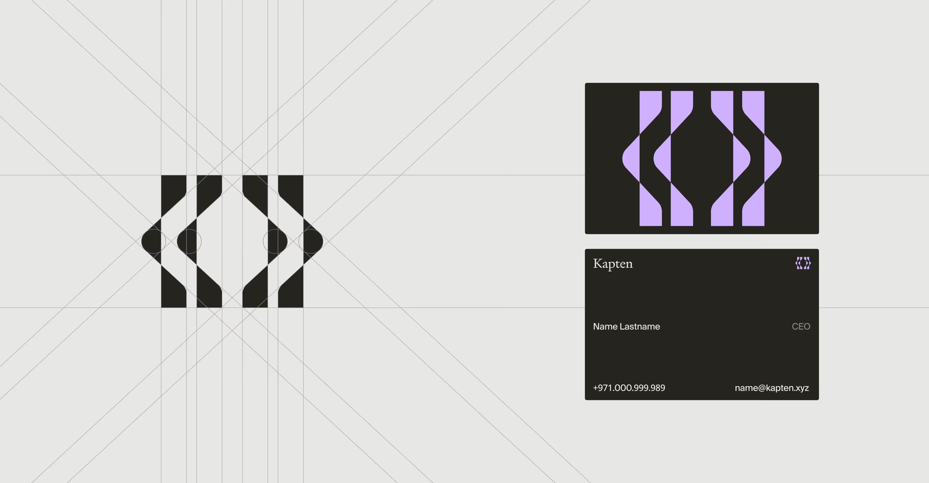
A deep violet palette chosen for its absence from the standard DevOps color spectrum. A logomark constructed from code bracket syntax — immediately legible to the target audience, distinctive to everyone else. Typography pairing monospaced precision with editorial weight, signaling that Kapten is both a serious tool and a considered product.
UI/UX design
03
A landing page concept built specifically for developer audiences: no stock photography, no vague benefit statements. Dense information, tight hierarchy, and interaction patterns that feel native to a developer workflow. Designed to convert skeptics, not reassure believers.
Motion design
04
A minimal motion system built to reinforce Kapten's core promise — speed without friction. Loop animations and UI transition states designed for product demos and investor decks, maintaining technical credibility at every touchpoint.
The brand made the product undeniable
Results
Before a single feature was demoed to investors, Kapten's identity communicated exactly what the product was: an AI tool built by people who understand how developers think. The visual system gave the founding team a credible market presence from day one — the kind of brand that signals product maturity before the product ships. The landing page concept became the anchor of their fundraising narrative, giving investors a clear, confident picture of who Kapten was built for and why it would win.

"The Bract team understood our users better than most developers we pitched to. The brand opened doors we hadn't knocked on yet."
Kapten