Branding
Constructivism and Your Brand: How Geometry Can Make You Shine
Are you tired of logos that all look the same? Flat, bland, and forgettable visual identities? You're a tech entrepreneur and you're tired of Apple's kind of websites? We feel you!


Are you tired of logos that all look the same? Flat, bland, and forgettable visual identities? You're a tech entrepreneur and you're tired of Apple's kind of websites? We feel you! Let's go back a century to post-revolutionary Russia to explore a movement that doesn't mince words: Constructivism. Raw, geometric, and functional, this artistic movement has everything you need to strengthen your brand identity.
I. What exactly is Constructivism?
Constructivism isn't just a random word from art history. It's a visual slap in the face, born in a post-revolutionary Russia that wanted to rebuild everything, even aesthetics. It was 1915, and Russian artists were saying to themselves: "No more gilding, bucolic landscapes, and half-naked cherubs. We're going to create art that serves a purpose." This is the DNA of Constructivism.
This movement isn't about sweet poetry: it mixes art, architecture, and industry to construct a utilitarian, geometric, and ultra-functional visual language. The idea is that art should no longer be hung on a museum wall, but integrated into everyday life: in posters, objects, buildings... and today, in branding.
Visually, Constructivism is:
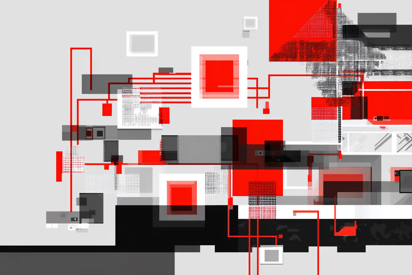
- simple shapes: circles, squares, straight lines, bold diagonals
- primary colors: a screaming red, a black that lays the foundation, a white that breathes
- sans-serif typography that says things clearly
And above all, a total rejection of unnecessary decoration. Here, we don't do pretty things for the sake of being pretty. Every line has a purpose. Every color has meaning. Every graphic choice conveys an intention. We're all about the raw, the straightforward, the direct.
Basically: Constructivism is the badass ancestor of today's functional design. And honestly? It's even more relevant in 2025 than it was in 1925.
II. What does Constructivist design look like?
Spoiler alert: if you like baroque swirls and pastel colors, move on. This is a graphic slap that gets straight to the point. No fuss, no frills. Just form, function, and maximum visual impact.
First ingredient: geometry.
Here, we're team square, circle, triangle. It's the reign of simple shapes that structure the space. Nothing is there for show: everything is constructed (hence the name, yes) to organize visual information. Looking at a constructivist poster? You see where your eye should be. It's design with built-in GPS.
Second ingredient: primary colors.
Bold red. Deep black. Crisp white. Sometimes an electric blue or bright yellow to counterbalance. It's visual, it's direct, it's flawless. And if today these codes make you think of startup packaging or a tech visual on Instagram... it's no coincidence.
Third ingredient: typography.
No frilly serifs. Constructivism relies heavily on sans-serif typefaces, often in capital letters, upright and solid. Why? Because the goal is to communicate effectively.
The result: a message that hits the mark, without filters or blurriness.

And above all, what ties it all together is a simple idea: design must serve a message. Not the other way around. We're here to inform, convince, and mobilize. And spoiler: that, in branding, is exactly what we're trying to do too.
III. How is Constructivism finding its way into today's branding?
You think Constructivism is good for Soviet museums and art history books? Wrong. This ultra-visual and minimalist style is making a resounding comeback in modern branding, and it's showing up where you least expect it: among startups, luxury brands, ambitious tech companies... in short, among those who want to make a lasting impression, quickly and effectively.
Why? Because in 2025, we're scrolling at 100 km/h. Brands only have a few seconds to capture your attention. And guess what: Constructivism is a formidable visual weapon for that.
Let's take logos:
Brands that dare to embrace graphic minimalism are clearly inspired by the Constructivist aesthetic. Simple geometric shapes, bold color blocks, bold, eye-catching typefaces. It's clean, it's clear, it's impactful. A biotech startup that wants to inspire trust and rigor? A square logo, a red/black/white palette, and it's all there.

Also look at web interfaces. Have you noticed this trend toward neatly arranged blocks, straight lines, and bold contrasts? It stems from a constructivist heritage: we organize information, we structure the screen, we guide the eye like a visual conductor. Nothing is left to chance.
And advertising campaigns? Some high-end fashion or cosmetics brands are having fun subverting constructivist codes in stylized visuals: ultra-graphic posters, slogans aligned like political slogans from the 1920s, striking diagonal montages. It's retro-futuristic, it's arty, it's classy.
The bottom line: whatever your company, Constructivism can offer you a strong, recognizable, and highly adaptable visual environment. And that, in branding, is a godsend.
IV. Why is Constructivism so popular in branding?
Spoiler: because it does exactly what we ask of a brand today: to be clear, memorable, and in tune with the times. We want a mindset: you don't say much, but you speak loudly.
Simplicity = effectiveness.
In a world where everyone is shouting, clarity becomes a superpower. Constructivism focuses on simple graphic elements and a message without blurriness. Throw a constructivist visual into a saturated Instagram feed? It stands out directly. It's clean, frank, and assertive. And that's what we expect from a brand that has something to say (and not something to prove).
Ultra-modern (even at 100 years old).
Ironically, this style, born in 1915, is more contemporary than 80% of the visuals we see in ads today. Why? Because it has that raw, sincere, and functional quality that speaks to a generation allergic to bullshit. Brands that embrace it seem bold, committed, and visionary. Basically: they have a backbone.
It goes with everything (really everything).
It's a bit like the dark side of graphic design: it adapts to all industries. Are you in tech? Perfect. Do you work for an organic coffee brand that wants to embrace transparency? Yes, it works. Do you want to launch a clothing line or a B2B platform? Constructivism can be twisted to suit the mood. It's both ultra-coded and incredibly flexible.

So yes, it requires rigor. But the result? Branding that pops, sticks, and makes a lasting impression.
V. 3 Brands That Play with Constructivism (Without Even Telling You)
It's right there, right under your nose, in campaigns you've already scrolled through. And here are three brands that have figured out how to use this aesthetic to stand out.
Supreme, Constructivism for the Streets.
Supreme isn't just a streetwear brand; it's a statement of identity that takes you on a visual whirlwind. Their logo, all red, square, with its striking white typography, is both simple and powerful, like a visual gravitational force that forces you to look. You see it, you recognize it, you know exactly what we're talking about, and you don't need anything more.
They've perfectly understood the movement. No unnecessary details. Just raw graphic efficiency. They use red to catch the eye, geometry to structure the space, and unadorned typography that gets straight to the point. It's a bit like an urban tag that tells you: "This is what we are, this is what we stand for."
And it works. Skateboarders, designers, young artists, everyone recognizes this aesthetic. Supreme plays on the fact that minimalist design has maximum impact. It's street Constructivism, a raw yet recognizable style that becomes a symbol in itself.

Aesop, geometric elegance that never shouts.
Aesop is living proof that you can say a lot without shouting. Their packaging? A masterclass in discreet Constructivism: invisible grids, no-nonsense typography, labels like graphic modules. No garish images, no storytelling that exhausts you, just a hyper-structured design, designed to convey confidence, rigor, and intellectual chic. Even their stores are arranged like Constructivist compositions. It's Zen, it's clean, and it leaves an ultra-strong visual impression. Branding calibrated to the millimeter to appeal to a demanding target, a little arty, a little snob, in short, exactly the kind of person who doesn't want a shower gel with a turquoise wave on it.

Nike, the art of giving you a graphic slap.
When Nike releases a killer campaign, they go all out: large, flat tints, stark contrasts, typography that spills out of the margins. Some of their "Just Do It" ads are pure Constructivism remixed for Gen Z: angular visuals, raw dynamism, a powerful message. It's not there to look pretty; it's there to engage you, get you moving, and electrify you. And in a world where everything happens in a 3-second scroll, this is exactly the kind of design that stops you in your tracks.

Conclusion
Constructivism isn't just a designer's whim: it's a strategic weapon for brands that want to assert themselves, cut through the ambient visual noise, and make a strong impact with bold graphic choices. If you want to create an impactful brand identity, why not tap into this century-old trend that, paradoxically, is more modern than ever? Want to dare to embrace a strong aesthetic that reflects your values and makes a visual statement?
This style could well be your best ally.
Frequently Asked Questions
Why is Constructivism relevant to branding in 2025?
In a world where everyone is shouting, clarity becomes a superpower. Constructivism is a formidable visual weapon clean, frank, and assertive.
What industries can use this style?
It adapts to all industries tech, organic brands, B2B platforms, fashion. It's both ultra-coded and incredibly flexible.
What's the core principle of Constructivist design?
Every line has a purpose. Every color has meaning. Every graphic choice conveys an intention.
Is this style really modern, or does it feel dated?
Ironically, this style born in 1915 is more contemporary than 80% of visuals seen in ads today because it has that raw, sincere, and functional quality that speaks to a generation allergic to bullshit.
How does The Bract use design movements like Constructivism?
We don’t follow trends, we translate them into strategy. Every visual choice is intentional, aligned with your positioning, and built to stand out.
%20(1).jpg)