Branding
Free branding resources for when you don't have the budget to hire an agency.

Because we never want to see you struggle, here are some resources you may find helpful when you'd like to create some content quickly and efficiently.


Hiring an agency can be expensive, and we understand that. Because we never want to see you struggle, here are some resources you may find helpful when you'd like to create some content quickly and efficiently. This article is for you if you need a quick logo and a color palette or some business cards. Of course, it will never be as good as a professional marketing & communication agency, but it will help kickstart your business and prepare a pathway to success!
Before designing, think twice.
When it comes to branding, you have to keep in mind that a logo is not just a pretty font. If you need some help on the process, you can review our pages dedicated to the subject: our Strategy page and our Branding page. Once you get the methodology, you can execute all your ideas.
Whatever you associate with your brand will resonate with your audience. Even if you are still a 'small company', you are never too far from a huge success, so it's best to set up the right foundations. In the future, it'll be easier to do a rebranding and then hire a professional agency if you need to.
So, what do you want to represent?
Before thinking about a specific design, take a quick look at your competitors and how they design their brand identity, then think about yours: Do you want something more on the friendly, positive, or chic and elegant side? Try to imagine how your target will perceive your design. Will it convey your brand values?
How to have fun with typography?
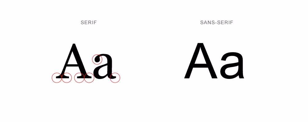
Keep in mind that a great font can be a logo by itself. So to help you select the right one, here are the basics you still need to learn. In typography, you have two main families: serif and sans serif. Serif was used in the past in books and journals to simplify the reading. Now, we like to remove it to have a modern look. The two mean a different thing. Serif will be more on the classic and elegant side. Sans serif is more modern and fresh. The weight of the font plays also. Thin or bold? Both will convey a different message.
Once you have an idea, you can select a font, shape, and some colors.
You can easily access valuable and free fonts on:
- Google Font: https://fonts.google.com/
- Font Fabric: https://www.fontfabric.com/free-fonts/
- Adobe Font, if you have an Adobe subscription: https://fonts.adobe.com/
- Font Squirrel is great for more original fonts: https://www.fontsquirrel.com/
Then, move on to colors.
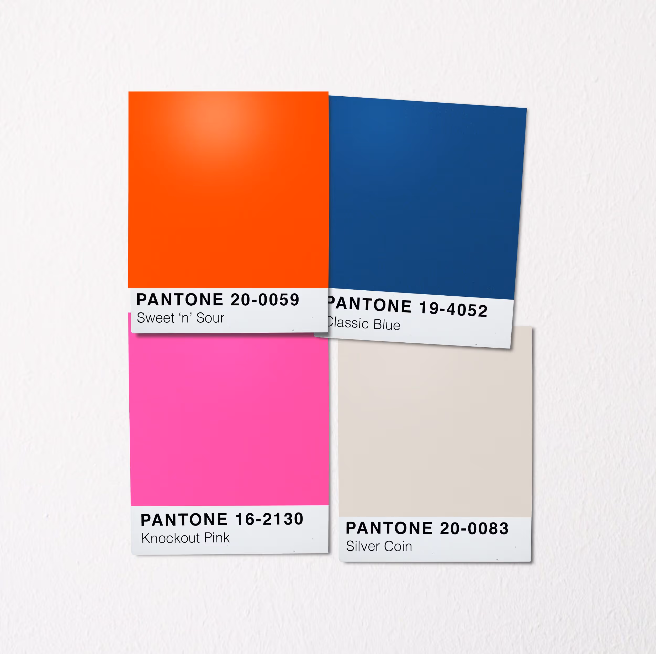
You can always stick to black and white and add a spark of colors here and there, but if you need dominant colors, ask yourself: Do you want vibrant colors? Or perhaps sleek, classic colors? Before, pay attention to the meaning of each one. Orange can represent intelligence and performance when blue is more corporate.
When selecting a color palette, a communication agency will often choose 2 to 4 primary colors. As you may not be a professional designer, we will recommend selecting two colors initially with a strong meaning. For example, select a turquoise and a bright orange, then play with its shades. We always consider black and white a part of the design.
If you want to get creative with colors, here are some other resources to find your color palette:
- Coolors is an excellent tool. It gives you a combination of colors instantly: https://coolors.co
- The Pantone selection is an easy way to find all the variations to your color palette. https://www.pantone.com/color-finder
- Or simply looking for color combinations on Pinterest: https://www.pinterest.com/ and https://www.instagram.com/awsmcolor/
In terms of design, you can always mix both. A classic typography with a vibrant color palette, or the other way around.
Make sure to register your colors with a # before: You'll find color codes such as #FFFFF or #00000. That way, you'll be able to see that specific color on any designer tool.
Move on to design.
To design your logo, we always recommend using a professional tool such as Illustrator from Adobe. If you're not well-versed in design, Canva is an excellent, user-friendly option if you need to create a quick logo https://www.canva.com/ .
Always remember to export your file as a PNG to be able to use it on any background. Prioritize white or black design if you are not sure on which support you'll display your design. If you use vibrant colors, for example, it may not appear as clearly on a picture.
Prioritize a simple design rather than one with too many elements.
You want your design to attract people's eyes, not deter them. It's essential to have your own ideas, but it can be helpful to take inspiration from large, successful companies. Most of them maintain clean and straightforward designs.
Do you need a symbol, an icon?
You'll see most of the big companies having a mascot. We prefer to avoid it in the beginning since a great symbol is tough to craft. It requires skills you may not have, and even a cheap freelancer from a marketplace won't have the background to execute it properly. Great font and some nice colors can be enough to get you started.
Photography and Icons.
Because branding doesn't stop at fonts and colors, you'll need some photographs and icons to illustrate your visual identity.
- For stunning, professional-quality photographs, Unsplash is fantastic, free, and super stylish: https://unsplash.com/
- Freepik can sometimes be helpful too. You may be able to find some lovely materials: https://www.freepik.com/
- For quick and easy icons, we love Flaticon and Icons8: https://www.flaticon.com/ & https://icons8.com/
- You can explore Icons8 a bit deeper and find some other great free resources such as Ouch, https://icons8.com/illustrations and some other like Moose: https://icons8.com/photos
So, you may already have some tools to play with. Always remember that your execution won't be as good as a communication agency, but that's ok; you can't be good at everything! If you need any help to get professional branding, we would be more than happy to help.
%20(1).jpg)